“Which form of proverb do you prefer, ‘better late than never,’ or ‘better never than late?'”
When we last launched a louisville.edu homepage redesign — on April 22, 2011 — the design was already seven months old. The explanation as to why likely falls outside of the realm of this particular discussion. Regardless, we feel as if we’ve been playing catch-up from the very beginning.
Since 2011 so much has changed on the web, both aesthetically and developmentally, but visually, our homepage has aged relatively gracefully. We worked diligently in 2011 to future-proof it as much as possible, making sure there was minimal trend-chasing and hoping to extend the longevity of the design. One thing that was impossible to plan for, however, was the exponential increase of mobile users, and it wasn’t until April 2015 that the homepage was finally made mobile-friendly.
Here we are several years on and louisville.edu is assuredly in need of a full-on redesign. So where is it?
The short answer is, “Soon.”
The Refresh
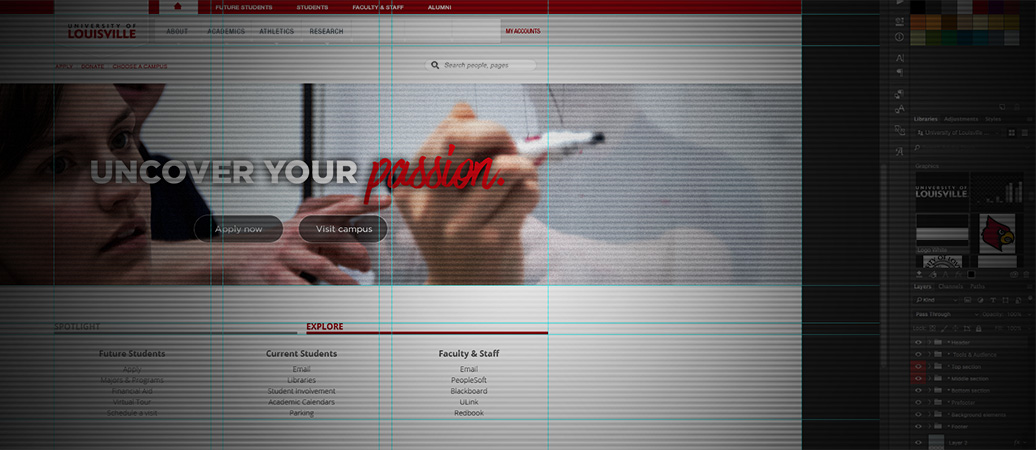
Doing a full refresh (visually, hierarchically, developmentally) of the homepage and top-tier properties is a heady task that would take a team of a half-dozen dedicated people 6 to 12 months to do correctly. Our homepage alone gets tens of millions of pageviews each year, so every single aspect of the project needs to be evaluated and considered. The process involves tons of competitive research, auditing the current structure and organization, concepting through wireframes and mockups, developing a new environment for deployment (and all of the crucial steps in between) … all before we even get to the steps of building and testing. We are working on this, even if we aren’t afforded the luxury of such resources or singular focus.
In the meantime, we believe there is a need to do a minor facelift. Nothing major. Nothing disruptive. A few tweaks here and there to extend the longevity of what we have. More ‘redecorating on a strict budget’ than ‘building a dream house.’
So in the spirit of full transparency, here are the goals of this refresh:
- Provide a stopgap solution for marketing directly to prospective students. We need to be speaking to prospective students better, digitally, in order to stay competitive. Our homepage is a main web property to leverage.
- Utilize (minimally) more modern design trends to extend the lifespan of the homepage until a full redesign is complete. Lots of trends have emerged since 2010, and while we can’t embrace them all at once, indulging in a few here will inject a bit of relevance.
- Achievable in a short amount of time (design + development + testing), so as not to disrupt work on the full redesign. We don’t want to spin our wheels on something that won’t be around for long, but we still want to do it correctly.
Challenges
Even though we’re talking about minor edits, there remain some primary obstacles to consider, including:
- Continuity: The original design is almost six years old. Aesthetic and developmental changes must seamlessly blend with an (obviously) aging system.
- User expectation: The refresh cannot be overly ambitious in scope such that it gives our users the incorrect impression that this is a half-hearted full redesign. This is not the time to show what we’re really capable of doing.
- Trust-keeping: A significant portion of our user base is comfortable and familiar with the utility and layout of the current design. They use it on a daily basis as a means to quickly access their online UofL accounts. Removing the utility aspect without providing supplemental benefit would erode any user trust we have built. So on that topic …
The More Things Change …
In 2010, the higher education industry had not settled on whether homepages were supposed to be used as a marketing tool (primary audience being the general public) or as an internal tool (primary audience being faculty, staff, students), or both. For many long years, the pendulum of trends and best practices swung back and forth. This explains why with our 2010 design we tried to carefully blend both, providing links that our Cardinal family needs on a daily basis, while also trying to serve prospective students, alumni, parents, donors, researchers, legislators and more.
Since 2010, however, it has become largely accepted that a university or college’s homepage is best used for marketing and recruitment. Many other tools and platforms have risen to popularity to handle the needs of internal groups, so the need for dedicating visual real estate on a homepage to these has waned.
In order for us to stay competitive, we must adapt. This refresh is our first step toward that.
The eventual full redesign will address the “utility for internal audiences” more completely. In the meantime, though, the same links and quick-access points to services such as ULink, Blackboard and more are still present. Check out the screenshots below for two places where you can still get the same links, should you need them:

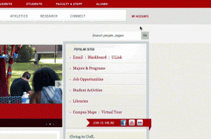
So there you have it. It’s an peculiar project to work on, trying to play catch-up on an outdated design and platform, making something look both familiar and fresh at the same time. At the end of the day, though, we’re just trying to make UofL look the best it can.
Better late than never? Or better never than late? We’re hoping for the former rather than the latter, and we’re excited for what’s even further down the road.


