


While attending a cocktail party a few years ago, Keith Kleespies crossed paths with his old friend Steven Skaggs, a professor and head of the Graphic Design BFA at the University of Louisville.
Kleespies, a retired graphic designer, shared his diagnosis of macular degeneration and how it was affecting his ability to read. He explained that central blindness would force him to scan a page line-by-line and letter-by-letter, then recompose what he had seen into words and sentences.
Skaggs, also a pioneer in visual design semiotics with award-winning
font creations in museums around the world, was curious to better understand the incurable disease.
This casual conversation kicked off a long-term endeavor for both men — to create a font that could be a game changer for those with macular degeneration. Skaggs thought it would be fun to explore a solution for his friend, while Kleespies was thrilled to lend his experience and expertise along the way.
At the time, a few fonts designed specifically for people with vision problems did exist, yet Kleespies did not find them helpful. “Almost all low-vision publications are printed in sans serif fonts,” he said, “which are absolutely the worst for legibility.”
Serif fonts include small lines or flourishes at the ends of letters and symbols. Sans serif fonts do not have these additions, making the letters simple and clean. So standard designer rules would suggest that stick figure-looking sans serif fonts, like Courier or Arial, would help Kleespies recognize each letter easier.
“But the sharp angles actually became distorted, slowing his progress,” said Skaggs.
For Kleespies, a popular typeface from the 1970s — called American Typewriter — had actually proven to be the most effective font for helping him read.
So Skaggs took what he had learned from his conversations with Kleespies and began designing a specific macular degeneration typeface. Of course, to be truly effective, it had to be equally readable for people with low vision as well as those with normal vision.
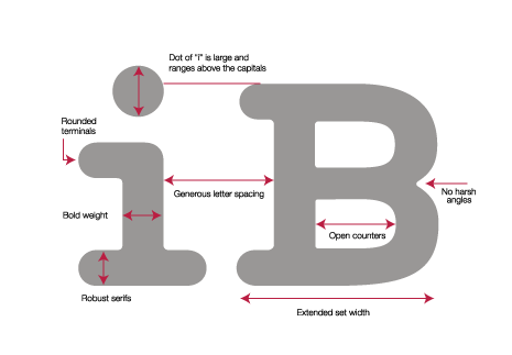
The font — initially known as Maxular Model A — used rounded edges and a bold weight. Each letter would be distinct to avoid confusion between characters that may appear very similar. And spacing needed to be balanced, ensuring that individual letters could be clearly identifiable yet also kept close enough together to be recognized
as words.
Throughout the process, Skaggs and Kleespies would meet at the Bambi Bar on Bardstown Road to test different sketches over burgers and beers. Kleespies’ graphic design background and love for typography proved invaluable as he was able to communicate technical changes with Skaggs to help Maxular continue to evolve.
Once Skaggs had a working prototype, the next step took place in a more scientific environment. Jennifer Gendeman, an occupational therapist in UofL’s Department of Ophthalmology & Visual Sciences at Kentucky Lions Eye Center, led the first clinical trials.
During the trials, participants with macular degeneration would read paragraphs of text in Maxular along with other common fonts. While some found Maxular helpful, others thought the unfamiliar letters were distracting and slowed their reading speed.
“The results showed that the strategy of differentiating by letter shape was not the way to go,” said Skaggs.
The conclusions from the initial trials helped Skaggs to modify the font even further and adopt more conventional forms of the letters in both upper and lower cases. The final result — Maxular Model B — is now operational and will soon begin additional scientific testing at the University of Minnesota to prove empirically that it works. “This study will be the most inclusive and broadest for font design for visual development,” Skaggs said.
As Maxular readies for widespread release, the ultimate goal is that Apple, Microsoft, Amazon and other major corporations adopt it as a choice in their default font settings. Small electronic screens, like smart phones and e-readers, are challenging and this would give individuals with low vision and macular degeneration a free option to use.
One former graphic designer is excited to see it in action and is proud of Skagg’s accomplishments.
“The design challenge was huge,” Kleespies said. “I’m elated that a designer of Steven’s caliber would be willing to take on this initiative.”
Beyond making a difference in the lives of macular degeneration patients, Gendeman also was impressed with how UofL’s interdisciplinary studies and research worked together to achieve a common goal.
“This was a unique collaboration between art, life sciences and medicine within the university,” she said.
Skaggs also noticed the combination of arts and sciences, even within himself. “I’m a graphic designer who is trying to create feeling,” he said.
That feeling may be pure joy for millions of Americans suffering from macular degeneration who aren’t ready to give up reading just yet.