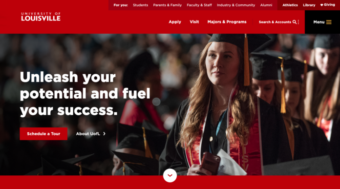
As part of a multi-year Web Improvement Project, UofL has introduced a new interim homepage designed to better serve current and prospective students, faculty, staff and the broader university community.
The most noticeable changes are a new design, more intuitive navigation and a mobile-first approach that positions the school for greater success in an increasingly competitive higher education space.
“We’re a dynamic research university with many departments and moving parts,” said John Drees, vice president of communications & marketing. “With this interim homepage, we grappled with how we could elevate the website to match the experience we’ve provided our community for more than 200 years.”
Three years of research and collaboration among the Web Improvement Project committees, the Office of Communications & Marketing (OCM), Information Technology Services (ITS) and Mighty Citizen informed all aspects of the interim homepage, including its design, content and information architecture.
By analyzing past user behavior and meeting with campus stakeholders, UofL and Mighty Citizen coordinated research efforts to better understand who uses the website and how. This past year, Mighty Citizen conducted interviews, focus groups and competitor and landscape analyses. Their findings informed decision making throughout the development process.
As a result, the new interim homepage prioritizes prospective audiences – especially students. It emphasizes major calls-to-action (i.e., apply and visit), improves pathways to key content and highlights the university’s academics, research and innovation and vibrant campus life.
Additionally, new audience-focused pages help current students, parents and families, faculty and staff and industry and community partners easily find the resources that are most relevant to them.
The tools that current students, faculty and staff use most often are highlighted within the Top Tools & Accounts menu, offering internal audiences quick access to resources like email, Ulink, Blackboard and WorkdayHR.
The methodical approach yielded key insights that will bolster UofL’s recruitment efforts by improving the user experience for our target audiences. The interim homepage uses techniques to align with user behavior and preferences of current and prospective students who primarily access the homepage on smartphones.
“The modern web user wants a clear path that meets their needs, and they want to get to their content in as few clicks as possible,” said Brad Anderson, ITS interim chief information officer. “And equally important, our research found that most of our site visitors, especially current and prospective students, were accessing our homepage from their phone.”
With these insights, the interim homepage paves the way for a digital experience that’s inclusive of all audiences, particularly prospective students who often have multiple schools to consider. It also makes it easier for faculty, staff, alumni and the broader community to find the resources they need.
“A website is the front door of an organization,” said Drees. “Visitors need to feel seen and welcomed. They want to know if UofL will help them achieve their goals. This interim homepage is an opportunity to do just that and support our broader strategic goal to be a great place to learn, discover, connect and work.”
The interim homepage is only the first step toward a more user-friendly digital experience across all of UofL’s websites. Web enhancements will continue to roll out over the next several academic cycles.
For more information about the Web Improvement Project, see this list of FAQs.
By Collin Overton, Office of Communications & Marketing


